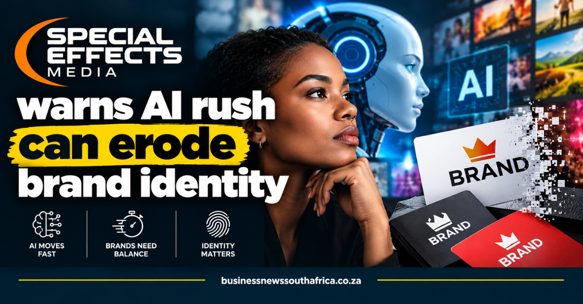
Special Effects Media (SEM) warned that the rush to use artificial intelligence (AI) in design can dilute a brand’s visual identity, a concern it raised in a recent press release on Bizcommunity.
AI, short for artificial intelligence, can produce polished images in seconds, but the firm argues that speed alone does not guarantee a design fits a brand’s established look. According to SEM, consistency is about adhering to a shared DNA, colour palette, imagery, type, composition and overall vibe, rather than copying every post.
Why consistency matters
SEM notes that a brand’s heritage used to take decades of print ads to establish. Today, digital heritage is built in real time, one thumbnail, banner or post at a time. Each visual asset deposits a piece of familiarity into the audience’s mind; over time those choices compound into recognition. Changing visual rules on a whim, the company says, erodes that equity.
The firm illustrated the point with a recent internal example: a thumbnail that looked fine at first glance but felt off in background and typography. By reverting to the brand guidelines, the documented rules for colour usage, text hierarchy and visual balance, the design was refined from “good-looking” to an asset that truly belonged to the brand.
SEM stresses that consistency does not mean every post must be a carbon copy. A YouTube thumbnail and an Instagram post can differ in format, yet they should feel like members of the same family. The company advises designers to place a new asset next to five recent posts and ask whether it belongs in the same family, whether a single element connects it to the rest, and whether every difference is intentional.
AI can generate endless options at speed, but SEM says it does not understand why a specific colour matters or why a polished layout might feel wrong for a particular audience. Because AI trains on the average of existing content, brands that aim to disrupt still need human designers to seek what hasn’t been done yet. In SEM’s view, AI accelerates momentum, but the designer steers.
The statements in this article are the company’s own claims and have not been independently verified. For readers looking for practical steps, SEM recommends a quick audit of recent assets against the brand guidelines before exporting any new design.
For the full press release, see Bizcommunity. More stories on branding and small-business design can be found in the SME & Entrepreneurship section.
SEM points out that the constant flow of content can tempt teams to hit “export” without a final visual check, a habit that risks drowning the brand’s distinct voice in a sea of similar posts, and stresses that mental clarity, not just speed, preserves unmistakable identity. The firm’s internal note describes how each thumbnail, banner or post adds a layer of familiarity that, when accumulated, builds audience recognition, echoing the earlier claim that digital heritage is forged in real time.
According to the company’s own guidelines, the brand DNA rests on five pillars: colour palette, imagery and type, composition and grade, and overall vibe. When designers compare a new asset against these pillars, they can determine whether the piece truly belongs to the brand family. The practice of placing a fresh design beside five recent assets and asking targeted questions helps surface any unintended deviations before the final export.
The press release explains that AI excels at generating polished visuals within seconds, yet it lacks the contextual understanding of why a particular hue or typographic choice matters to a specific audience. Because the algorithms learn from the average of existing content, they tend to reinforce prevailing trends rather than foster disruptive innovation, leaving space for human designers to inject originality.
In the workflow described by SEM, designers first use AI to produce rapid layout variations, then pause to reference the brand guidelines for colour usage, text hierarchy and visual balance. This two-step approach ensures that the speed of AI does not override the strategic intent behind each visual element, allowing the creative compass to stay steady amid a flood of options.